
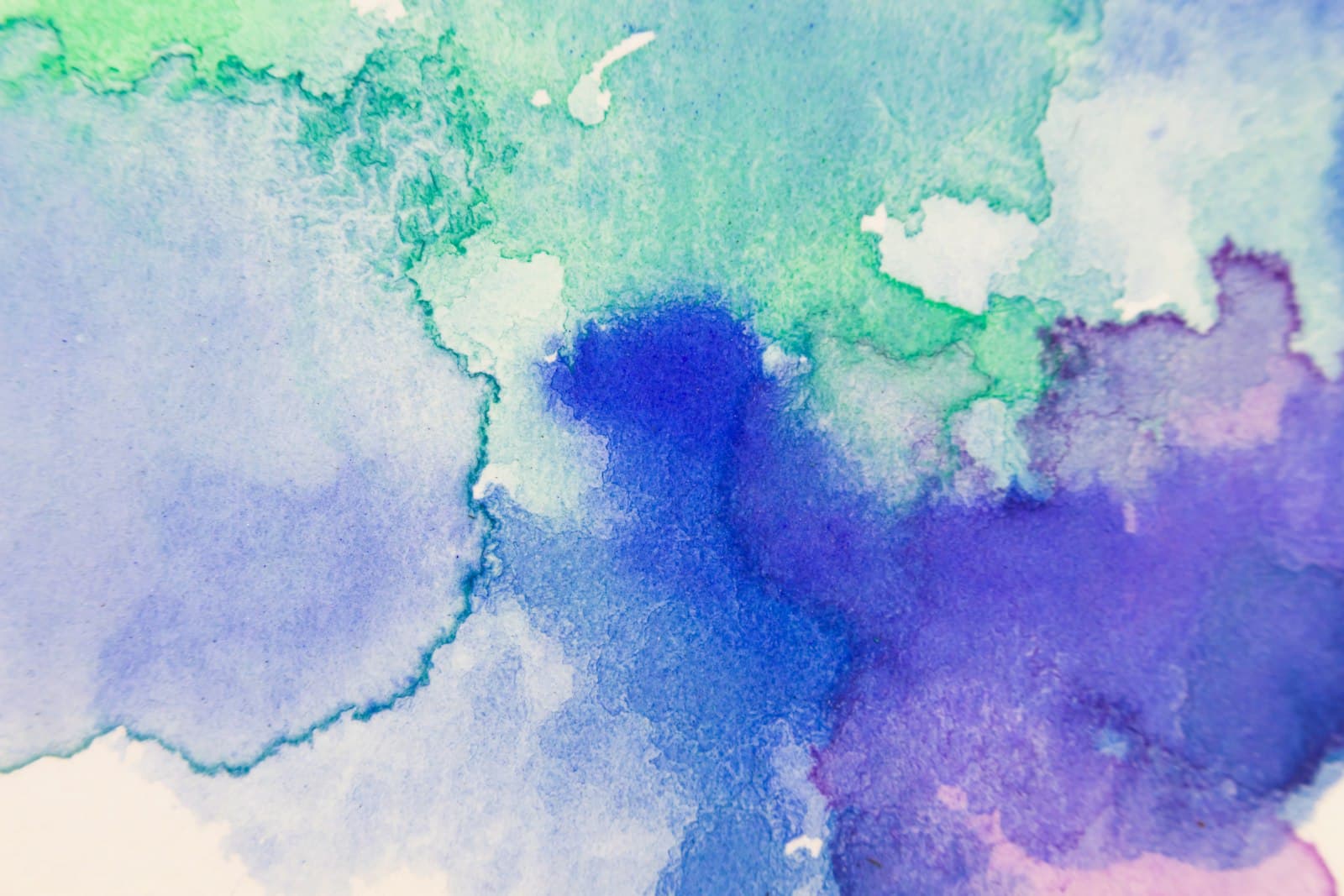
You ask for watercolor anime art and get a normal anime illustration with a faint paper filter over it. The lines are still hard, the colors still flat, and nothing about it feels painted. That's the standard failure: "watercolor" alone is too weak a word to pull a generation away from the crisp digital cel look that dominates anime art.
Real watercolor has specific physical behaviors — pigment pooling at edges, colors bleeding into each other, white paper showing through — and the model reproduces them only when your prompt names them. This guide covers the keywords, palettes, and subject choices that make the style land. Everything here runs in the watercolor style generator.
What keywords actually produce a watercolor look?
Prompt the medium's behavior, not just its name. These are the terms that pull a generation toward genuinely painted results:
an anime girl in a summer dress, watercolor painting, soft color washes, wet-on-wet blending, pigment blooming at the edges, visible paper texture, white background bleed, loose brushwork
Each phrase maps to something watercolor physically does. Wet-on-wet blending gives you colors that melt into each other instead of meeting at a hard boundary. Pigment blooming produces those darker halos where paint dries unevenly. Visible paper texture and white background bleed keep the ground of the image papery instead of digital. Use three or four per prompt alongside your subject.
The other half is what to remove. Watercolor anime usually works better with soft pencil underdrawing or no hard outlines in place of the thick digital linework the model defaults to — hard black cel lines are the loudest signal that an image isn't painted. If stubborn digital sharpness keeps creeping in, add flat digital art, cel shading, hard vector lines to your negative prompt, per the negative prompts guide.
What color palettes suit watercolor anime?
Watercolor is a translucent medium, so it favors palettes that stay light and let the paper glow through. Directions that consistently work:
- Pastel and airy:
soft pastel palette, pale pink and mint, lots of white space— the storybook look. - Warm and nostalgic:
warm ochre and burnt sienna washes, golden afternoon light— reads like a sketchbook page from a travel journal. - Cool and melancholy:
muted blue-grey washes, rainy season palette, soft indigo shadows— quiet, atmospheric scenes. - One-accent:
mostly grey wash with a single red umbrella— limited color is a watercolor tradition, and it gives the image an instant focal point.
What to avoid: prompting for vibrant, neon, or high contrast. Saturated, punchy color pushes the generation back toward digital illustration because that's where those looks live. If you want neon, cyberpunk is the right style for the job; watercolor's strength is restraint.
Which subjects work best in this style?
Watercolor flatters some subjects and fights others. It excels at anything soft, organic, and atmospheric: portraits with loose hair, gardens and flower fields, rainy streets, seaside towns, food illustrations, quiet interior scenes. Its diffuse edges naturally suggest gentleness and memory, which is why the style shows up in anime ending credits and light-novel illustrations.
It struggles with hard-surface subjects — vehicles, armor, dense city detail — because the medium's whole character is the absence of hard edges. You can generate a watercolor mecha, but you're prompting two opposite instincts at once. For a full map of which anime styles suit which subjects, see the anime art styles guide.
A subject pairing that reliably lands: a girl reading by a window, watercolor painting, soft morning light, wet-on-wet blending, potted plants on the sill, visible paper texture, muted green and cream palette.
How do I use watercolor pieces once I have them?
The style's soft detail and generous empty space make it unusually practical. Watercolor scenes work well as phone and desktop backgrounds — the calm, low-detail areas leave natural room for icons and widgets. They also make distinctive profile pictures precisely because most avatars are crisp digital art; a painted PFP stands out in any comment thread. And because the style reads as hand-made, it suits anything personal: card designs, journal headers, gift images.
Generate at the largest size available if you plan to print or use the image full-screen. Watercolor's soft edges hide upscaling artifacts better than most styles, but paper texture turns muddy when stretched too far.
Paint your first wash
Open the watercolor generator, start with the reading-by-the-window prompt above, and swap the subject for your own. Keep three medium keywords, keep the palette muted, and drop the hard outlines. If the first result still looks too digital, that's the negative prompt's job — add cel shading, hard vector lines and re-roll. Pick a plan or a credit pack when you sign up and you're ready to generate.
Cover photo by Greg Rosenke on Unsplash.