
You want a Japanese-style illustration of your character, you open a generator, and two presets stare back: anime and manga. They come from the same tradition, share the same faces, and most people pick one at random — then wonder why their "manga" cover came out looking like a screenshot from a show, or their "anime" panel reads like a coloring-book page. The styles are siblings, not twins, and each is the right answer to a different question.
The short version: anime is the animation look — full color, cel shading, cinematic lighting. Manga is the printed page look — black-and-white ink, screentones, panel-ready compositions. Everything else follows from that split.
What actually separates anime style from manga style?
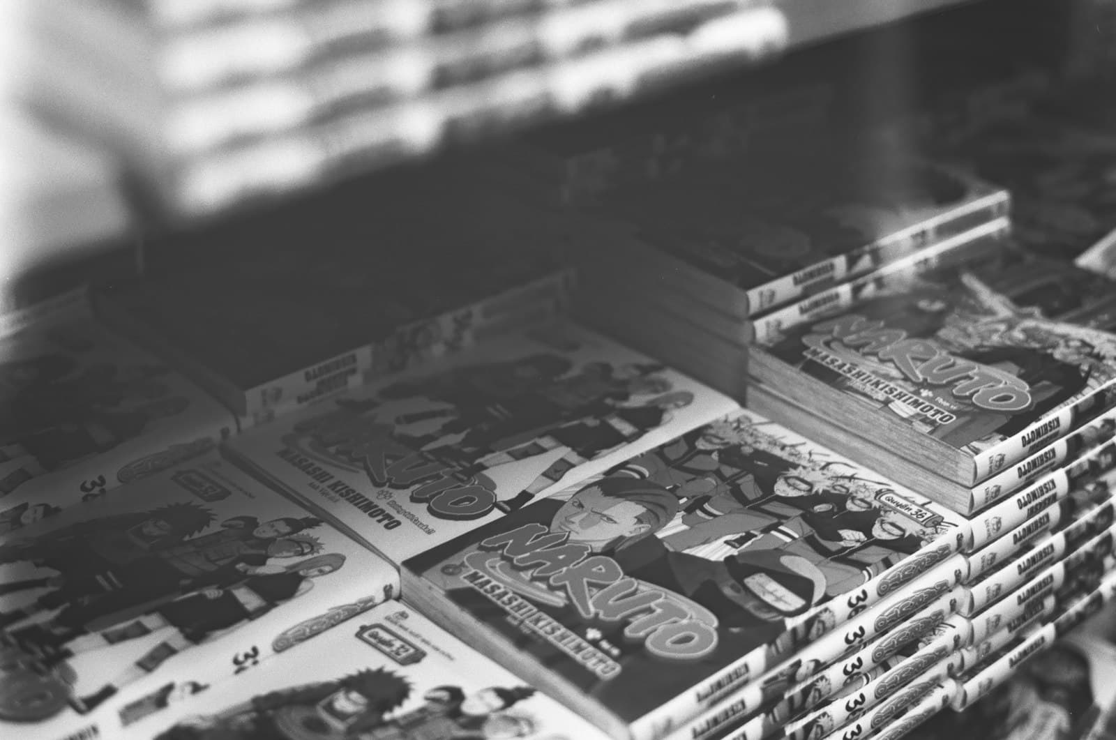
Color versus tone. Anime renders in full color with cel shading: flat fills, hard shadow edges, and lighting effects borrowed from film — rim light, lens flares, golden hour. Manga is built for ink on paper: pure blacks, white space, and screentones — those dot and hatch patterns that stand in for gray and texture. When an AI generator gets "manga style" right, you should see the dots.
Lighting versus linework. In anime style, light does the emotional work; a sunset can carry a whole frame. In manga style, the line does everything — line weight, speed lines, and tone contrast create drama without a single colored pixel. That's why manga generations often look more intense than their anime equivalents: the style has spent a century compressing emotion into black and white.
A frame versus a page. Anime style produces a moment from a show: one composed, cinematic frame. Manga style carries the visual grammar of print — dramatic angles that read fast, faces pushed to extremes, compositions that expect a panel border and a speech bubble. Prompt for "manga panel" and the model will even leave room where text would go.
Both share the underlying anatomy — the expressive eyes and clean facial construction of Japanese character design — which is exactly why the presets confuse people. The anime style page and manga style page show the same tradition rendered through each lens.
When should you pick anime style?
Pick anime when the final destination is a screen and the image stands alone:
- Profile pictures and social posts. Color survives compression and small sizes; screentones turn to gray mush at 40 pixels.
- Wallpapers and standalone illustrations. Anime's cinematic lighting is designed to make one frame feel complete.
- Anything headed to video. If you plan to animate the image later, generate it in anime style — a full-color cel-shaded frame is what video models expect as a starting point.
- Mood-first images. Rain-soaked streets, sunset rooftops, cozy interiors: when atmosphere is the subject, you want anime's color and light vocabulary.
Prompt-side, lean into what the style does best: name the lighting (golden hour rim light, neon glow), the palette (muted pastels, high-saturation), and the era if you want one (90s cel anime has a distinct warmth).
When should you pick manga style?
Pick manga when the image is part of a story or needs the printed-page energy:
- Actual comic pages. Panels, covers, and character sheets that need to sit next to each other and read as one work — the full pipeline is in our manga generator guide.
- Action and impact. Speed lines, impact frames, and hard blacks make manga the stronger style for a punch, a sword draw, or a dramatic reveal.
- Emotional close-ups. The trembling-eyes close-up with screentone shadow is a manga invention, and the style carries it better than color does.
- Print and merch. Black-and-white ink survives printing, laser engraving, and t-shirts in a way subtle color grading doesn't.
Prompt with print vocabulary: black and white manga panel, screentone shading, heavy ink, speed lines. Leaving color language out of the prompt matters — "manga style, vibrant colors" is a contradiction the model resolves by ignoring one half.
Can you mix the two?
Deliberately, yes — and the hybrids are some of the best-looking outputs available. Two proven directions:
Manga structure, anime finish. Prompt a manga-style composition — panel framing, speed lines, dramatic angle — but in full color: anime style, manga panel composition, speed lines, dynamic low angle. You get the storytelling energy of print with the polish of animation. Colored manga covers work exactly this way.
Anime scene, ink accents. Keep the color frame but pull in ink textures: cel anime style with rough ink outlines and crosshatch shadows. The result feels hand-drawn rather than studio-produced.
The one mix that reliably fails is asking for both halfway — "semi-manga, slightly colored" gives the model no anchor. Commit to one style as the base and borrow specific elements from the other. If you're still calibrating your baseline, the broader anime art styles guide maps the whole family tree.
Run the same character through both
The fastest way to internalize the difference costs two generations: write one character description, run it once with the anime preset and once with the manga preset in the playground, and put the results side by side. One of them will feel like your version of the character — and now you'll know which preset to reach for without guessing.